

Pretty brands fade. Purple cows get remembered.
And yours might be prettier than it is memorable.

You spent time on your brand. You picked your colors carefully, found a font that felt right, you put together a mood board that made you feel something, and you wrote a bio that sounded professional enough to post without cringing.
And it looks... good. Genuinely good.
So why does it feel like nobody’s noticing?
You’re posting, showing up, doing the things you’re told to do. But the engagement is thin, the inquiries aren’t coming, and when someone does find you, they scroll through your feed, maybe tap a post or two, and disappear.
That’s the part nobody talks about.
The part where your brand is objectively pretty, and completely forgettable at the same time.
The thing about pretty
Pretty is easy to achieve in 2026. Any decent Canva template, a cohesive color palette, a few stock images that match, and you’ve got a feed that looks like a brand.
But looking like a brand and being one? Not the same thing.
Here’s what I mean. Think about the last brand you genuinely remembered - not because their grid was nice, but because something about them made you stop mid-scroll. Something felt different, like they weren’t playing by the same rules as everyone else in that space.
That’s not by accident but by choice.
And most founders never make it. Not because they don’t care, but because nobody tells them it needs to be made.
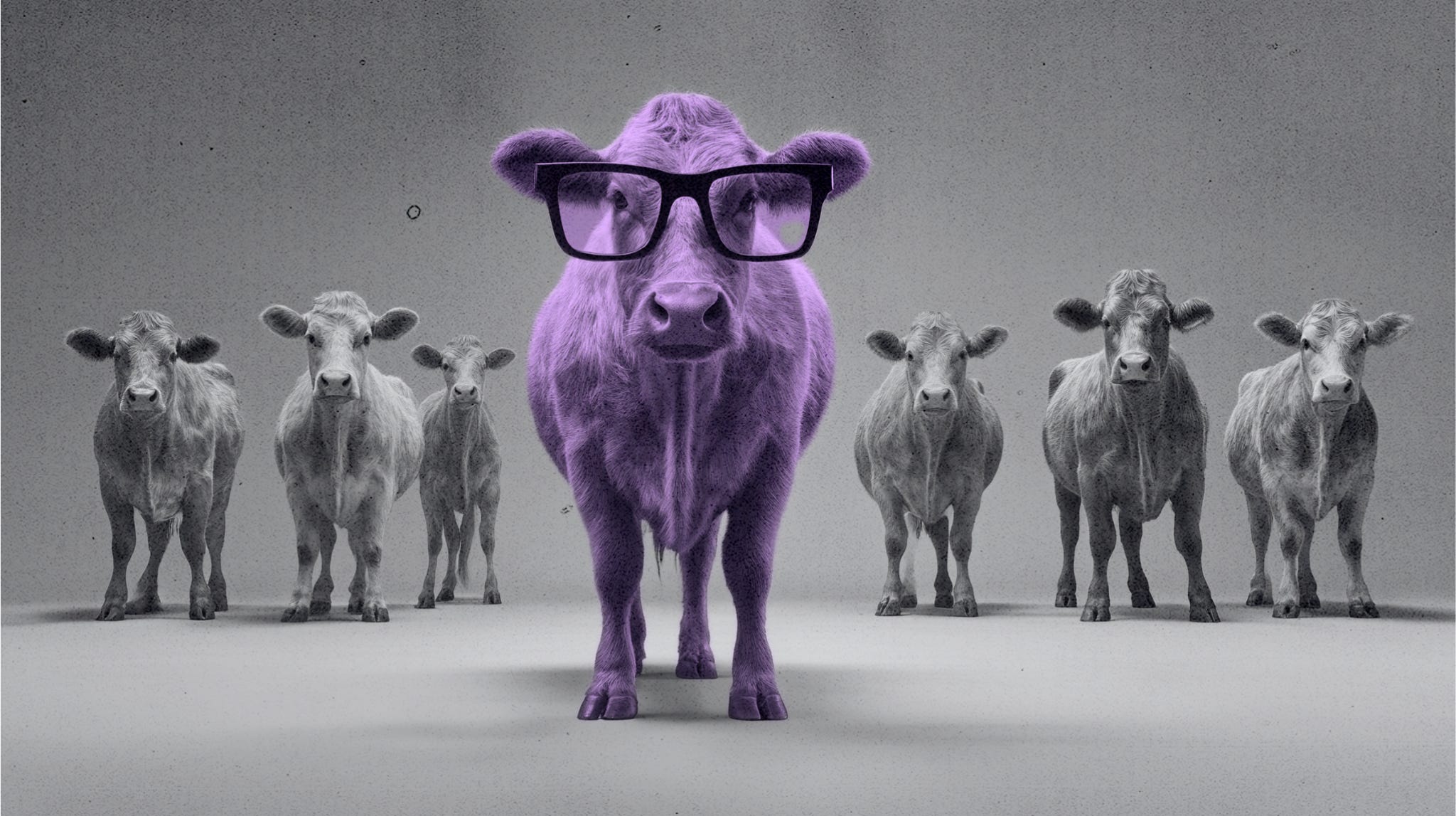
The Purple Cow problem
Seth Godin wrote about this years ago, and it still lands. You’re driving through the countryside, you see cows. Brown ones, black and white ones, the usual. After a while, you stop noticing them. They blend together. They’re fine.
But a purple cow? You’d slam the brakes.
Not because it’s beautiful but because it’s different. Because your brain can’t file it away as “seen this before.” It demands attention before logic even kicks in.
Your brand needs to be that purple cow.
And right now, if you’re being honest, it might be the pretty brown one. Well-fed, well-groomed, completely unnoticeable.
Why this happens
You built your brand by looking sideways.
You looked at what competitors were doing and thought: I need to look credible, I need to look like I belong here. So you borrowed their codes - their language, their color logic, their level of polish. You made something that said “I’m a real business” instead of something that said “I have a specific point of view that is mine alone.”
That’s how entire niches end up looking like one brand copy-pasted twenty times.
Clean serif fonts. Neutral palettes. Phrases like “helping you step into your power” or “building the brand of your dreams.” Smiling stock photos. Safe.
Well, safe is the problem.
Safe doesn’t stick, safe doesn’t make people talk, safe fills your feed with content that gets polite likes from people who will never buy from you.
What actually makes a brand stick
What makes a brand stick is a point of view, a belief. Something the brand stands for or against that is specific enough to make some people feel deeply seen and maybe make a few others slightly uncomfortable.
That discomfort? That’s not a problem but the signal working.
When your brand has a real stance, people self-select. The right ones lean in, the wrong ones leave and that’s exactly how it’s supposed to work.
A brand that tries to speak to everyone ends up resonating with no one. Not because of bad design, but because it says nothing. It’s a polished placeholder where a real brand should be.
Think about the brands that have a hold on you. Not just ones you’ve bought from, but ones you feel something about. Brands you’d recommend without being asked.
They have an opinion, they made choices other brands in their category refused to make, they sound like a person not a mood board.
That’s what’s missing when a brand looks good but doesn’t land.
If this hit somewhere, stick around. This is what I write about - building brands that do the heavy lifting so you don’t have to perform your way into visibility.
The uncomfortable question
If your brand disappeared tomorrow, would anyone miss it specifically?
Or would they just find the next similar option and barely notice the gap?
That’s not a question to make you spiral, it’s a diagnostic. And if the honest answer is “they’d replace it easily,” that tells you something important: your brand hasn’t made itself irreplaceable yet.
Irreplaceable doesn’t come from better design, it comes from a clearer stance.
It comes from answering questions most brands avoid:
What does my brand challenge? What specific idea, norm, or bad advice does your brand exist to push back against?
What belief are you inviting people into? Not features or benefits - what does someone have to believe to be the right fit for you?
Where are you playing it too safe? Where are you borrowing language, tones, or aesthetics from your category because it feels safer than owning your own?
These aren’t branding exercises, they’re clarity exercises. And clarity is what builds a brand people feel something about.
Pretty is the starting line
There’s nothing wrong with a good-looking brand. Visuals matter. First impressions matter. You want people to take you seriously when they land on your page.
But the goal of good visuals isn’t to look pretty. It’s to stop the scroll long enough to communicate something, and if what you’re communicating is “I look like everyone else, just slightly more polished”, you’ve won nothing.
The founders I see building real momentum aren’t the ones with the most refined aesthetics. They’re the ones who made a decision about what their brand stands for and then had the courage to make that decision visible - in their language, their visuals, their messaging, their content.
They chose signal over safety.
And the beautiful thing is that choice doesn’t require a loud personality, it doesn’t require you to go viral or do anything that makes your skin crawl. It just requires clarity, a real stance, and the willingness to let that stance be seen.
That’s what a purple cow actually is. Not outrageous, not edgy for the sake of it, just unmistakably itself.
You’ve got the pretty part down.
Now it’s time to figure out what your brand is actually saying.
Hi, I’m Jessica.
So glad you’re here reading my stuff. Thank you for that!
I help quiet founders build brands that stand out without the constant visibility grind. Disruptive branding, sharp positioning, and strategy that works even if you hate being on camera. Most strategists talk about alignment. I talk about opposition.
New essays hit your inbox weekly. Subscribe if you want in. Unsubscribe whenever. No guilt trips. Just good strategy and the occasional swear word.
Thank you, Jess! This was great!